Misleading Logarithmic Scales and the Disregard for Energy Efficiency
A chart linking low energy consumption with poverty is widely shared on social media. The graphic uses a misleading visualization, and if we look at the data more objectively, it tells a very different story - one that highlights the potential of energy efficiency.

A graph widely shared on social media pages appears to show a strong correlation between wealth and energy consumption. It comes with a catchy claim ("No such thing as a low-energy rich country") and plots the per capita gross domestic product (GDP) and electricity consumption of countries.
It uses a highly misleading visualization method. If one looks at the data more objectively, a very different picture emerges.
The social media posts usually come without attributing a source, but the oldest source I could find is a post on Substack by Todd Moss. A slightly different variation of the graph has been posted by Moss in an article on the web page of his organization "Energy for Growth Hub".
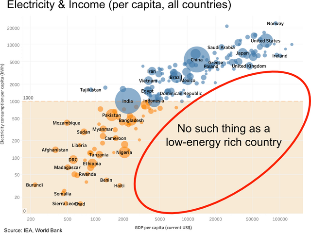
Several things are inaccurate. The headline mentions income, yet the graph plots GDP per capita. It makes a claim about energy, yet the plot only shows electricity consumption. Furthermore, it does not show all countries, as the headline claims. Also, while the graphical representation appears identical in both versions, one of them attributes the data to the IEA (the International Energy Association), while the other attributes it to EIA (the United States Energy Information Agency).
While this is all extremely sloppy, it does not change the overall picture. One could correct all these mistakes and create a similar graph.
The biggest issue with this graph is another one. If you look at the axes, you can notice that the distance between the same differences is not equal. For example, on x-axis, the distance between 0 and 1,000 is more than twice as large as the distance between 1,000 and 2,000. The graph uses what is called a logarithmic scale or short log scale.
This has the effect that the more you move to the upper right part of the graph, the less visible differences will become. Countries with higher GDP and electricity consumption get squeezed together.
Logarithmic scales can be misleading
Using logarithmic scales to communicate data is problematic because many people do not have an intuitive understanding of them. In the early days of the COVID-19 pandemic, researchers ran an experiment showing people visualizations with logarithmic and linear scales. Not only was the comprehension of the data much lower with the logarithmic scales, but it also impacted the participant's policy preferences. (However, a similar experiment by another group of researchers around the same time did not share that latter conclusion.)
An earlier study published in Nature in 2019 that surveyed ecologists suggests that even scientists often have trouble intuitively understanding logarithmic scales.
Logarithmic scales should only be used in a scientific context, and even there, they should always come with an explanation and a justification. Logarithmic scales can be misleading, and using them in public communication is almost never a good idea.
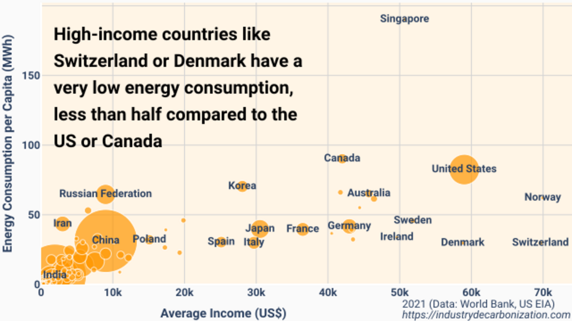
Going back to the graph from the beginning, what would it look like if we corrected all the mistakes and used a simple linear scale? The following graph uses energy consumption data from the EIA and average income from the World Bank for 2021 (the same year used in the original). For some countries, the data is not yet available, and to improve readability, countries with a population below 5 million are not shown, and labels in the crowded areas have been removed. I am sharing the code and the exact data sources here, and you can find an unfiltered, zoomable version and variations like GDP vs. electricity here.

We can easily see why the original graph used a logarithmic scale. Without it, there is no large, free space in the lower right corner for a catchy, misleading claim.
On a more serious note, what we can see here is quite interesting. It is true that there are many low-energy, low-income countries, as evident by the accumulation in the lower left corner. For low-income countries, there is also a strong correlation between energy use and income. But above a certain threshold, we can see countries all over the place, and the correlation becomes very weak. (In statistical terms, we get r=0.19 for countries with an average income above 20.000 US dollars and r=0.68 for those below. The r values were calculated over all countries where data was available.)
We can also see that, in direct contradiction to the catchy claim on the original graph, there are high-income countries with a rather low energy consumption. The most notable ones are Denmark and Switzerland, with an energy consumption of around 30 MWh. Their per capita energy consumption is less than of the United States (82 MWh), and around a third of Canada (90 Mwh).
There is also a country with a notably high energy consumption and very low incomes: Turkmenistan. But the World Bank dataset has no income data for 2021 yet. Therefore, it is not in the graph. In 2019, Turkmenistan used 84 MWh per person, with an average income of 5530 US Dollar.
Switzerland uses less Energy to do the same things
Switzerland and Denmark are small countries, and maybe there is something special about them. For example, both countries have a strong pharmaceutical industry, which tends to generate substantial value without excessive energy use.
In a study created for the Swiss State Secretariat for Economic Affairs (SECO), researchers from the German Institute for Economic Research (DIW) have tried to separate different factors for the low energy intensity of Switzerland's economy compared to other European countries. The study is only available in German but contains a one-page summary in multiple languages, including English.
While what the researchers call structural effects – meaning Switzerland has sectors that generally consume less energy – do play a role, they are not the main factor. In their summary, the researchers write: "A decomposition analysis within the manufacturing industry shows that Switzerland produces more in industry sub-sectors that are generally less energy-intensive (structural effect) and also produces more energy-efficiently within the sub-sectors (intensity effect), with the intensity effect being significantly stronger."
In other words, the primary reason for Switzerland's low energy intensity is that, compared to its European neighbors, Switzerland uses less energy to do the same things.
What do we make of this data? A reasonable conclusion would be that a baseline level of energy availability and consumption seems to be important to get countries out of poverty. However, above a certain baseline, the connection is almost nonexistent, and using less energy is possible for very rich countries. While it is likely not the best policy prescription to call for lower energy use in developing countries, surely lowering it in countries with excessive energy consumption sounds like a good idea.
Context matters here. The posts from Todd Moss, where he uses these graphics, focus almost entirely on increasing energy access in low-income countries. And there is nothing wrong with that. While I disagree with some of the details, most of what Todd Moss writes there does not appear particularly controversial to me. However, he does seem to have a blind spot when it comes to energy efficiency.
The many people who shared the graph are overwhelmingly not talking about providing basic energy access to developing countries. The message that it transports is that higher energy consumption is always associated with financial wealth, and the misleading representation hides the fact that this is simply not the case.
Cleaner energy, more energy efficiency, or doing less
When we take a step back and look at the bigger picture, the fact is that greenhouse gas emissions from energy use are the main reason for climate change. There are, in essence, three ways to tackle this. Emission-intensive energy sources can be replaced with cleaner energy sources. Energy can be used more efficiently. And humans can decide to limit or reduce doing certain things. It will likely require all of these approaches.
Increasing energy efficiency, which simply means using better technologies that need less energy to provide the same service, should not be particularly controversial. But it often faces substantial resistance, and the ideology of energy consumption as an unquestionable good certainly plays into that.
A related and important topic is that by moving to cleaner energy sources, and by electrifying processes, increased energy efficiency often comes with that. Most energy from fossil fuels is lost as waste heat, and renewable energy sources can often provide the same service with a much lower energy input.
Finally, I want to briefly mention some more fundamental concerns one can have about comparing incomes, GDP, and energy consumption. Neither average GDP nor average income are necessarily the best predictors of poverty or wealth, simply for the reason that they are averages. Inequality plays a role, too. Even more fundamentally, one can question whether GDP — or income — are good indicators of overall wealth and human well-being.
Another concern is how prescriptive current realities are for future decisions. While we can see from the data that a rich country like Switzerland can have a relatively low energy consumption, that does not mean that this is the best we can achieve. Many technologies enabling much better energy efficiency are only starting to get traction. While we can certainly learn from existing data, it does not mean that we cannot do better.
The implicit assumption of an infographic like the one above is that there is an unchangeable reality. It not only belittles the energy efficiency we can already achieve today but also the possibility of using better technology in the future.
I contacted Todd Moss before writing this article to share my concerns and give him an opportunity to comment. I have not received an answer.
If you see the misleading graph shared on social media, consider answering with a link to this post. If you want to answer with an infographic with a less misleading visualization and a correct claim, you can find one in PNG format here and in SVG format here.
Thanks to Robert Gieseke, Tom Stafford, and Andrew Gelman for feedback during the creation of this text.
A video of a short presentation I gave at the Berlin Hack & Tell event can be found on YouTube.
Author: Hanno Böck

